Type: A Collaborative Freelance Project
Industry: Smart Protein-based Foods
Time Taken: 3 weeks | Software Used: Adobe Illustrator, Adobe Photoshop, Blender, Figma
Contributions: Brand identity and strategy, Visual identity, Packaging design
Progo is a brand set upon becoming the change it wishes to see in the world, one delicious plant-based snack at a time. Aware of the judgemental image that vegan food has in our society, Progo aims to be a more inclusive, friendly brand that offers food choices everyone can make, regardless of where in life they're at. Because everyone deserves the right to make a more compassionate world for themselves, starting right from their cravings.
The founder of Progo, Yashvanthraa (or as we call her, Yashu) came to us with the determination to create a people, planet and palate-friendly brand that was both accessible and affordable.
We worked together with her to create a visual identity and brand strategy that brought out Progo's personality, and designed packaging for the Progurt plant-based yogurt range as well.
For more about Progo, Progurt and the brand, visit their website: https://www.progofoods.com
CUSTOMER PROFILES
The 'I want a little bit of it all' customer (and why not?)
People in their early 30s living in Tier 1 and 2 cities, who have an active lifestyle and are conscious of their protein intake, as well as of their diet as a whole, preferring plant-based foods. They seek to meet their nutritional needs without too much effort due to their busy working schedule. They want something different from protein shakes and bars, seeking taste as well as convenience and variety, without worrying about the costs of such a choice.
Accessible and Affordable Choices
Unfortunately, the present dairy alternatives in India are in an expensive, premium range, and often have issues with criteria such as protein content and taste, as well as mouthfeel and other factors. In a country where 9 out of 10 people consume less protein than needed, it is imperative for us to provide an option that fulfils all these needs, while also remaining accessible and affordable to all.
Snacking without the guilt
Vegan foods and the people associated with them are often looked at negatively, which we aim to change. As a brand accepting and inclusive of all the choices people make, we simply endeavour to make them conscious of what they choose, whatever they may be.
Food with Love, From Us to You
But what does this mean for the brand itself? Progo aims to change the way people look at plant-based foods. Instead of seeing them as something 'other', to consider them as food that can be made part of one's everyday diet. After all, there are a multitude of reasons which prompt people to make the switch. Making more sustainable and healthy choices should be available to everyone, and that is exactly what we set out to do.
BRAND NARRATIVE
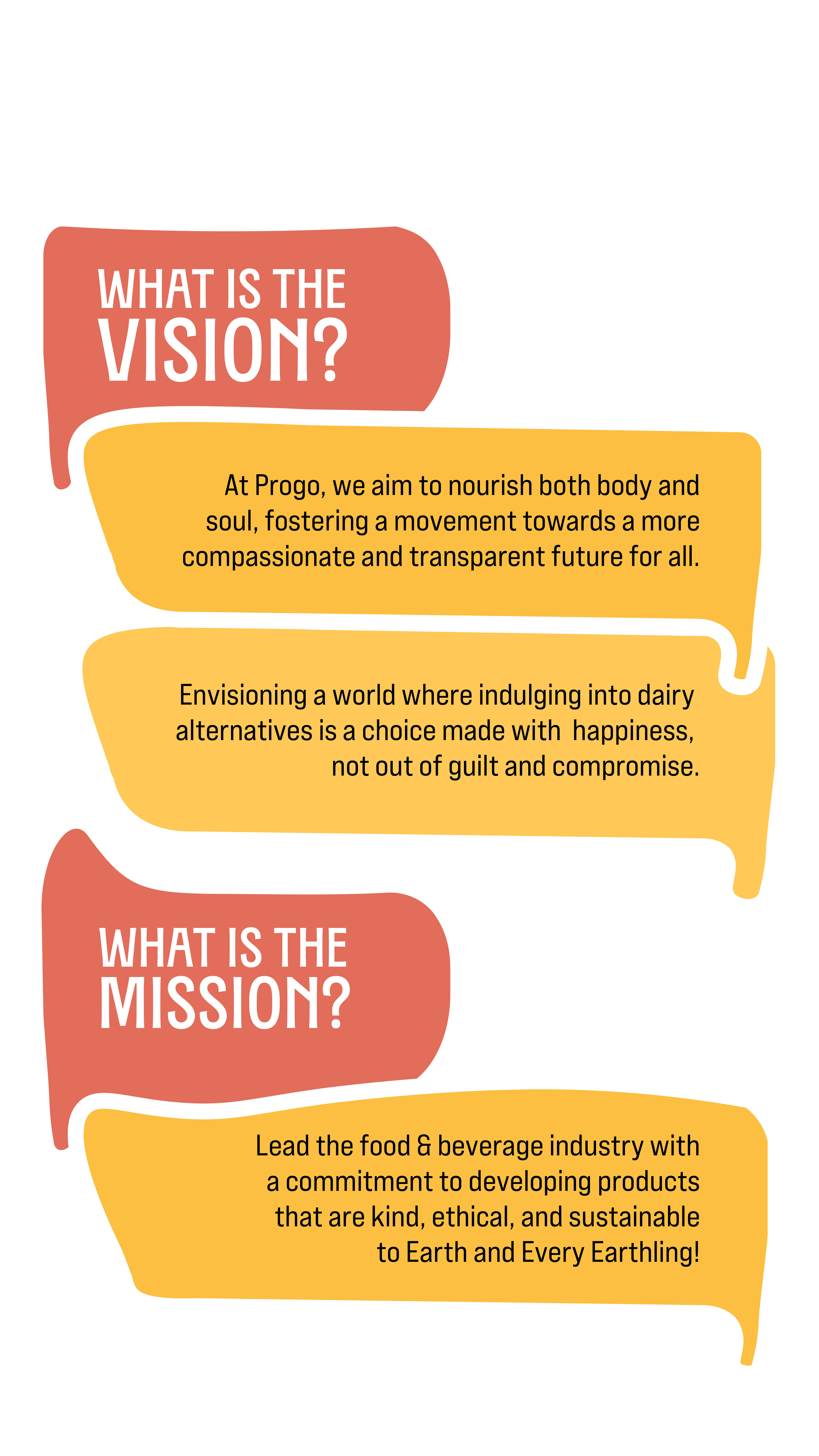
At Progo, we aim to offer food choices that everyone can make, regardless of where in life they’re at. Because we believe that everyone deserves the right to create a more compassionate world for themselves, starting right from their cravings.
LOGO
We went through multiple rounds of iterations, keeping in mind the main concept behind the brand- transparency and simplicity, accessibility and the vision of a kinder world for all living beings. All of these came together to form the logo, consisting of custom condensed glyphs.
The brand was beginning with a yoghurt product, but wanted to expand into other plant and animal-friendly offerings in the future. Thus we had to ensure the logo would fit well in all such situations, and thus decided on a type logo.
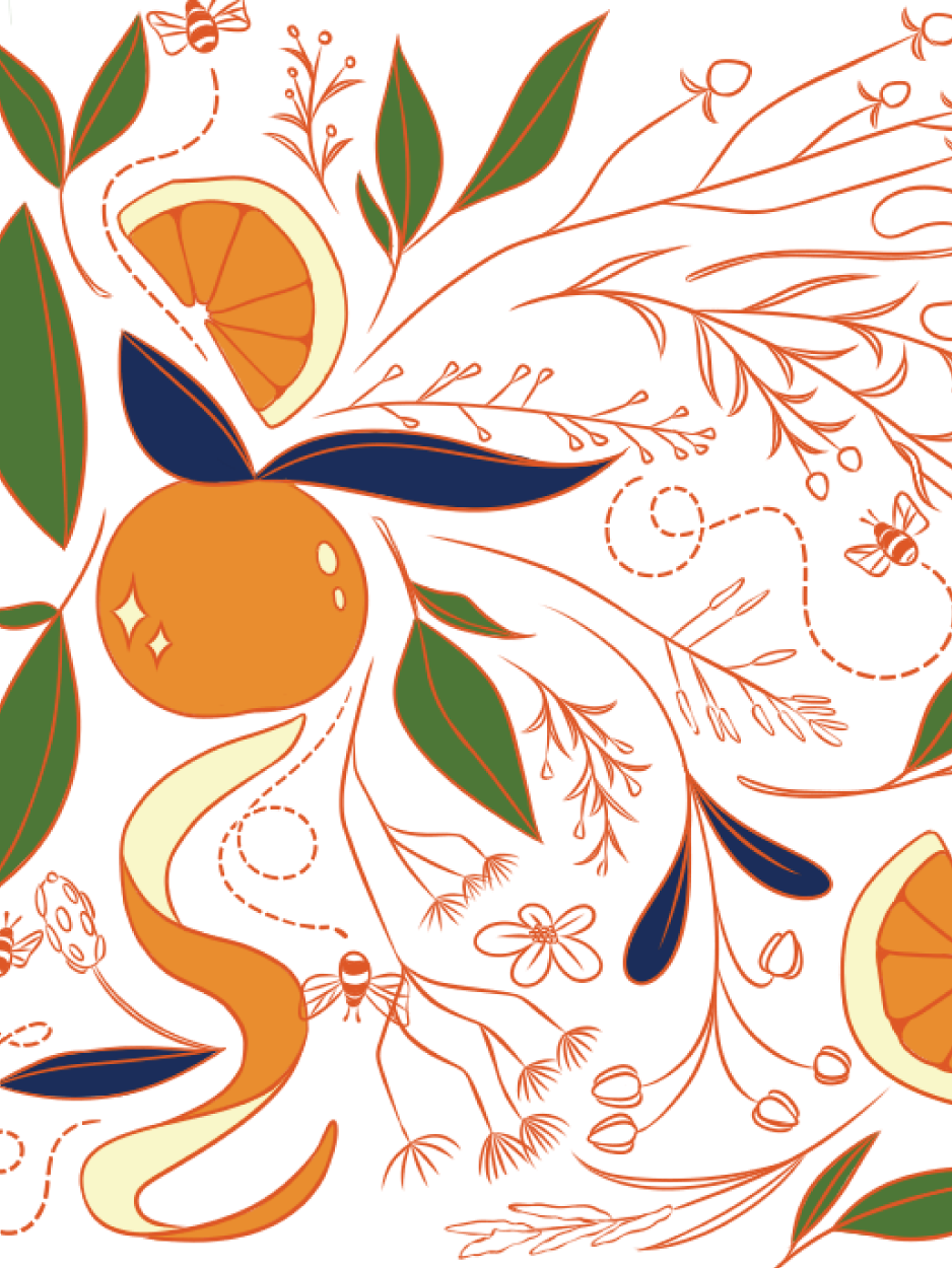
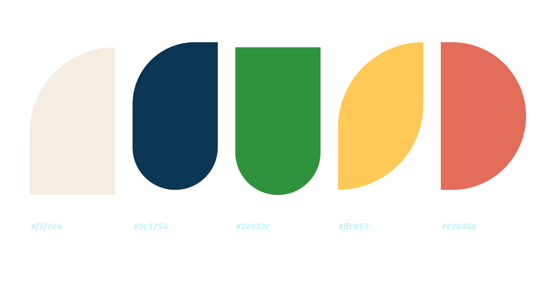
COLOURS
The colours represent our dedication
to the planet in all its natural beauty, while
also redefining what veganism can be.
Bringing kindness and sustainability
but also joy. Helping our planet doesn’t
come at our cost. These are some of the
small things that matter to us, at Progo.
to the planet in all its natural beauty, while
also redefining what veganism can be.
Bringing kindness and sustainability
but also joy. Helping our planet doesn’t
come at our cost. These are some of the
small things that matter to us, at Progo.
We celebrate the happiness that comes
with making healthy, sustainable choices.
TYPOGRAPHY
A strong, bold but fun font that has its
own quirks, just like Progo!
TXC Pearl
A smooth, well-rounded, cute font, to remind us
of all the cute animals we do this for!
Iskra
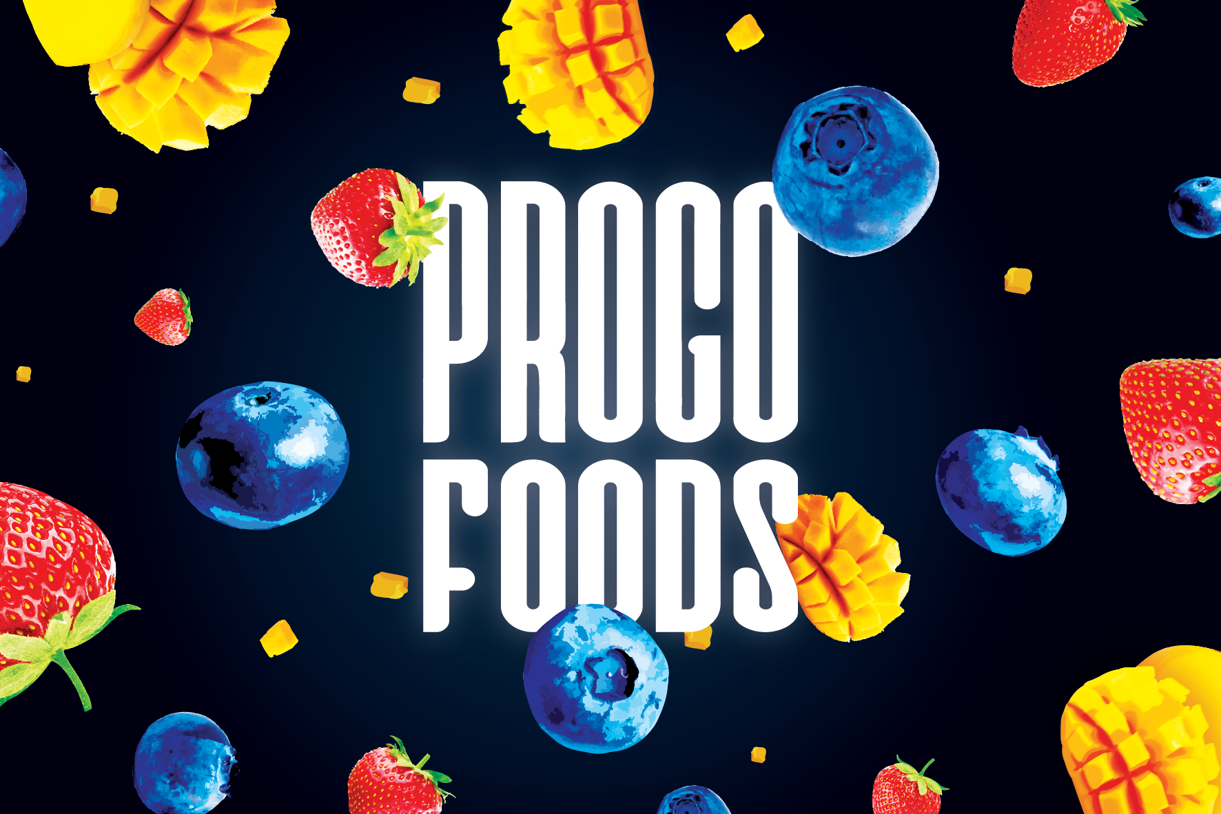
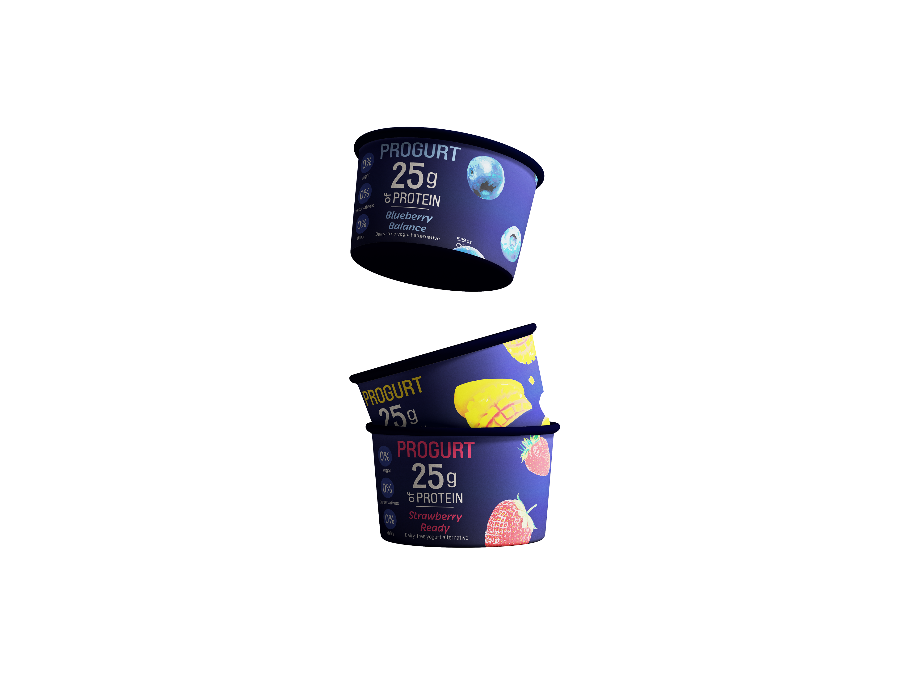
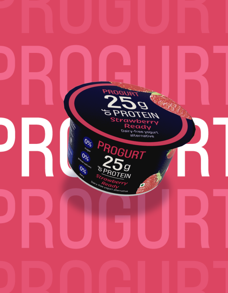
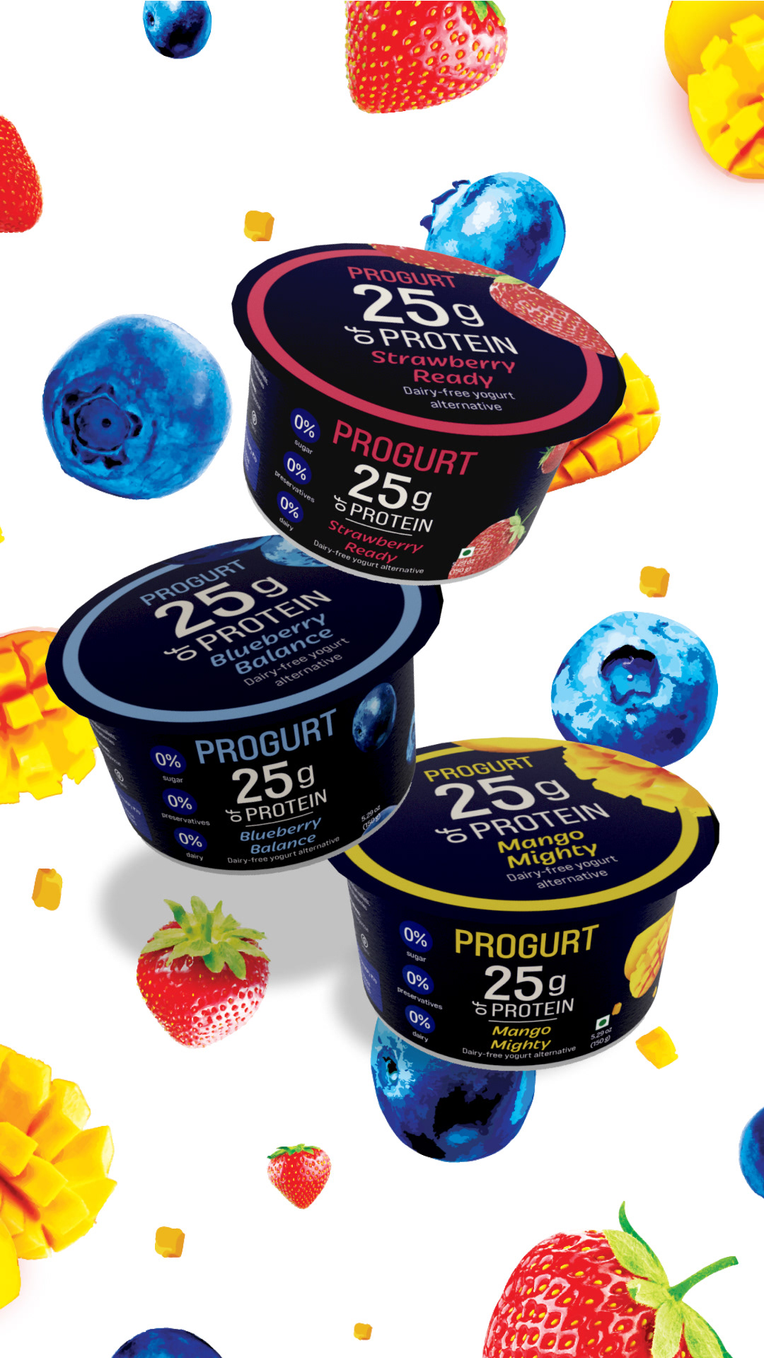
PACKAGING
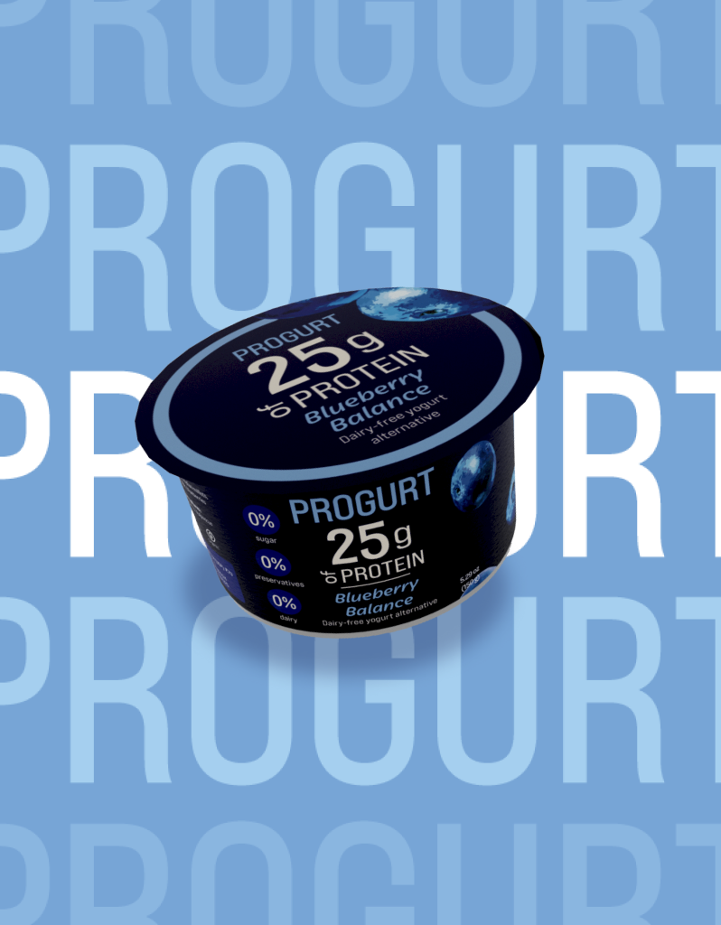
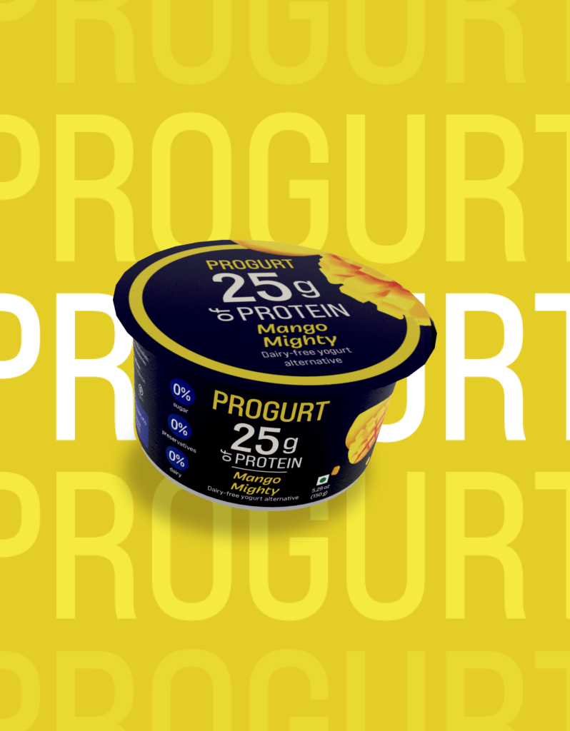
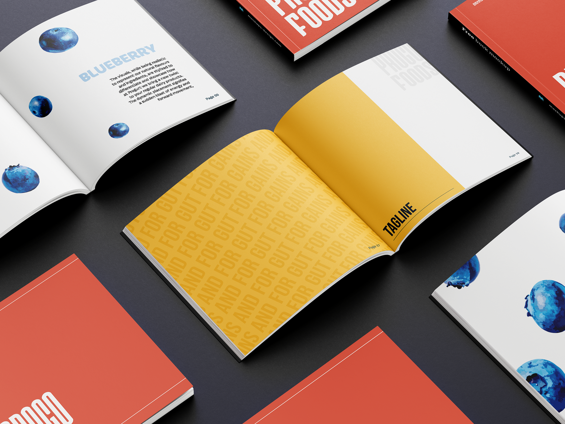
The visuals, while being realistic to represent our natural flavours and ingredients, are stylised to differentiate and showcase how Progurt brings a new twist to the regular dairy products seen in the market today. The dynamic placement signifies forward movement and freshness.
Progurt's packaging showcases its dedication to being accessible to all- from those with a greater protein requirement to others who may not be able to consume dairy.
Bright, saturated colours as well as the placement of the brand elements are used to embody the energy the product itself aims to provide. With 25g of protein, Progurt brings with it a pop of colour, a burst of energy and fun to your daily workout sessions, post-gym nutrition needs, or even just the fresh nutritional burst one may need after a long day of work.
COLLATERALS
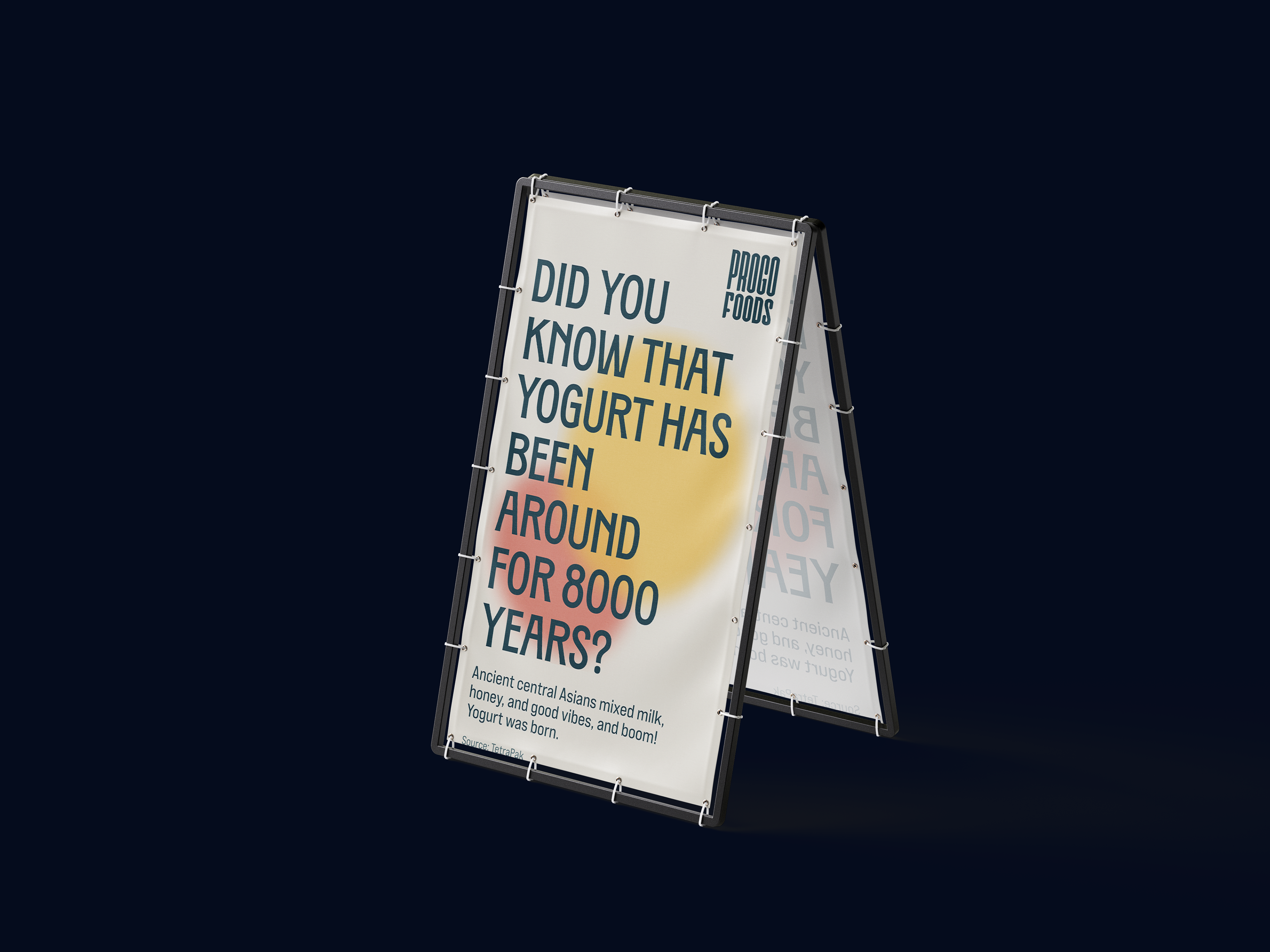
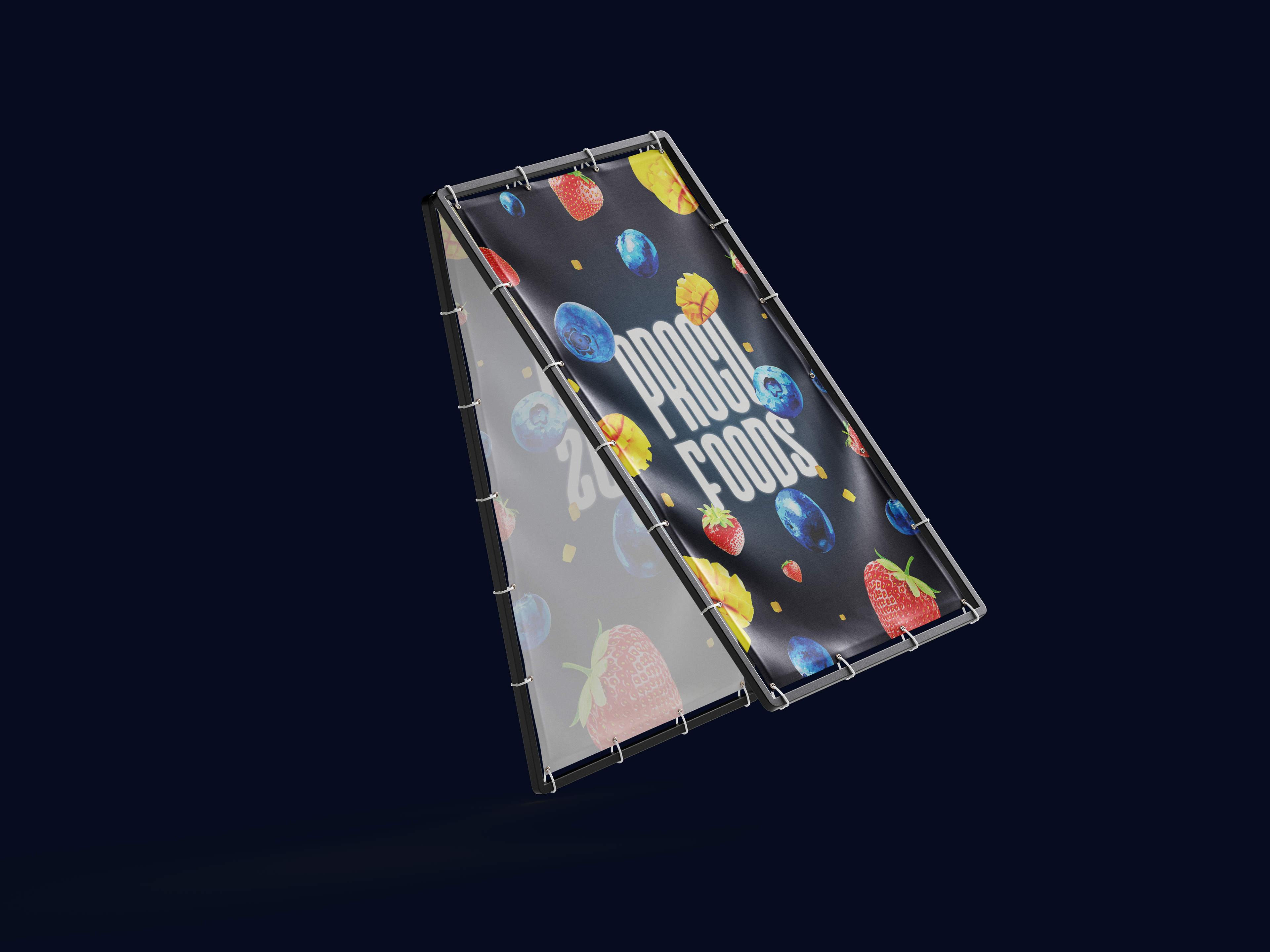
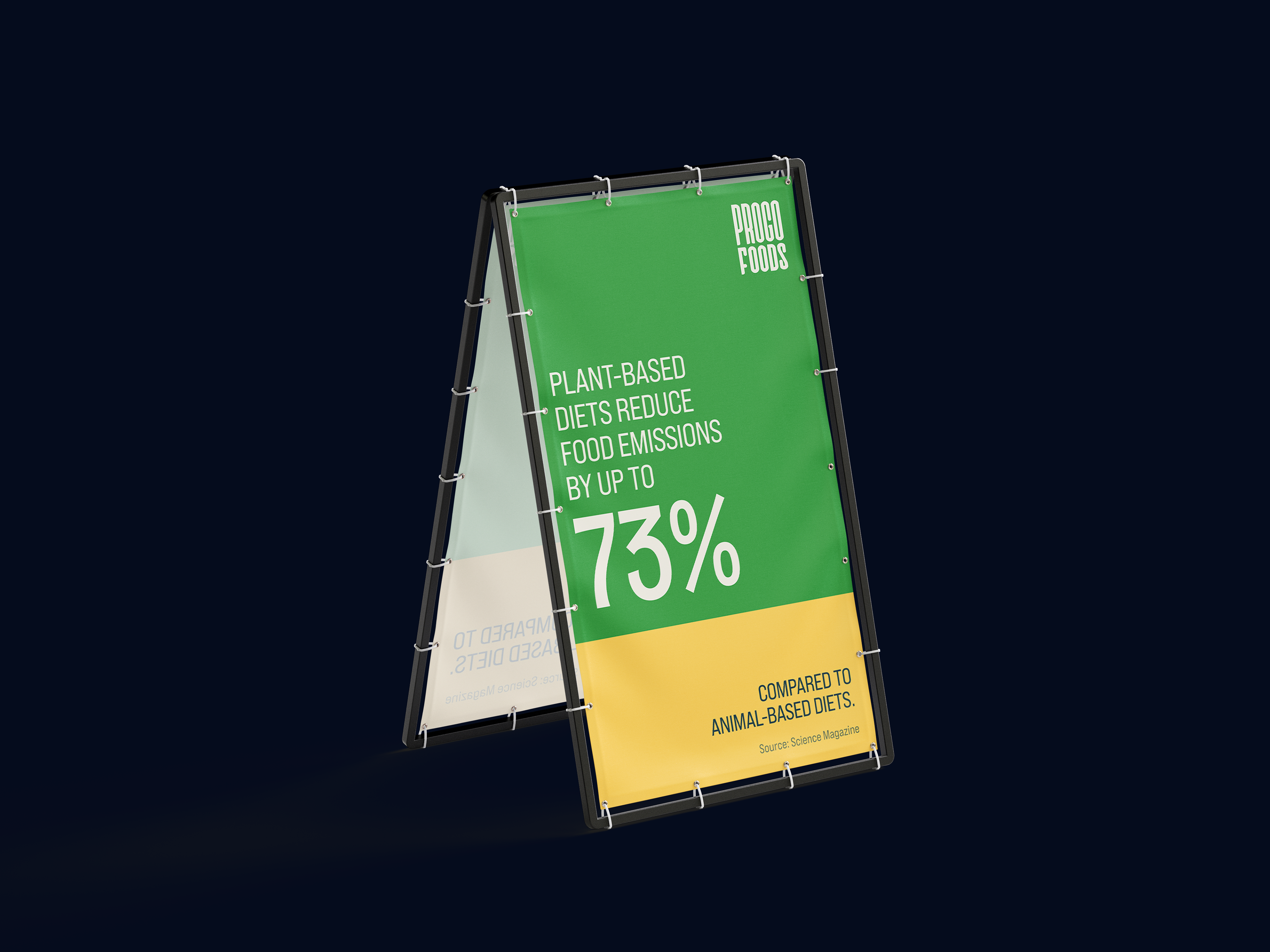
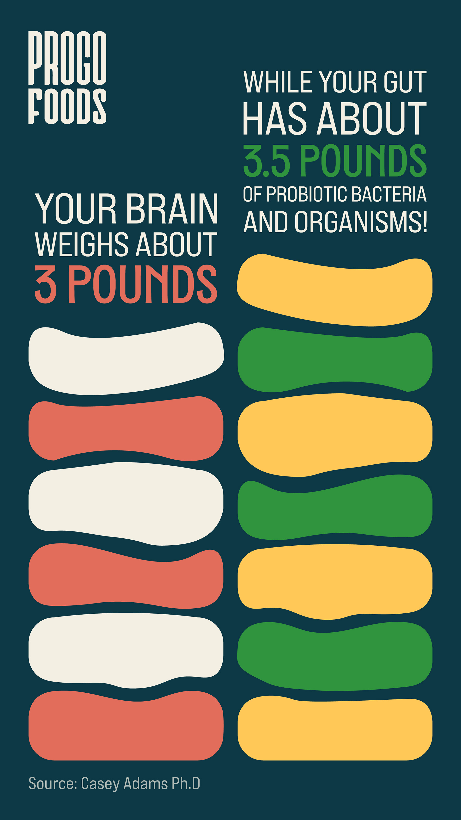
Some of the creatives made for display screens at an expo at the Codissia Trade Fair Complex