Type: Personal Project
Time Taken: 3 weeks | Software Used: Figma, Microsoft Excel
I have always been interested in the ocean and that which inhabits it since I was a young child, choosing to go swimming in it and exploring it both in the water as well as in the form of information on it.
Inspired by the various storytelling data visualisations we were introduced to in class, I decided to make a project with a larger amount of data compared to what I had been handling before for my assignments and chose to focus on the phenomenon of coral bleaching.
Also known as the ‘rainforests of the sea’, coral reefs are home to nearly a quarter of all marine life, serving as a repository of medicinal, agronomical and industrial products. However mass coral bleaching, once occurring at an average rate of once every 25–30 years in the 1980s, now returns about every six years and is expected to further accelerate as conditions worsen, destroying these beautiful marine habitats.
The first thing I always do when starting a new project is to look at what is already available on the internet, in order to get an idea of what has been done and what new ideas I could get from them. Especially since this was my first project using a big dataset, I did not really have many sources, and hoped that my research could give me a starting point.
There is a lot of information about coral bleaching available online, while at the same time, it is very scattered. And most of it is for Australia's famous Great Barrier Reef, which has suffered expansive and irreversible bleaching in the past decade, easily visible due to its extent as well as its popularity. However, I wanted to make a project that included the coral reefs of other countries, including India.
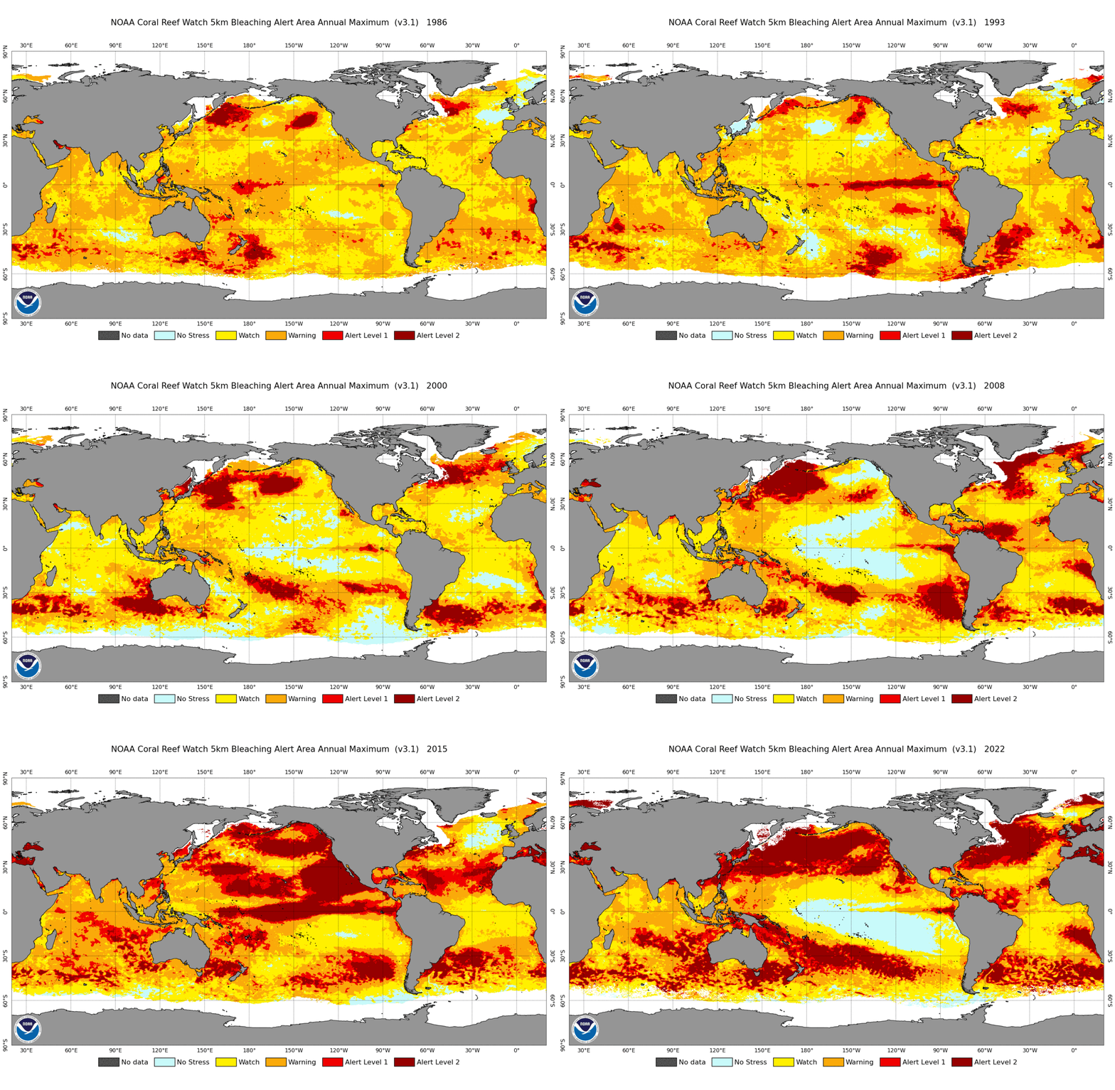
NOAA Coral Reef Watch 5km BAA Map Data (1986-2022)
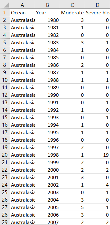
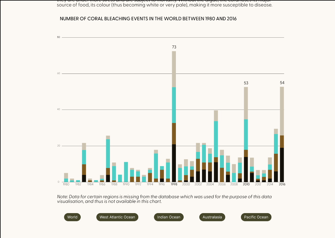
Number of Coral Bleaching Events (1980-2016)
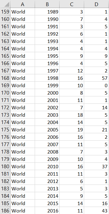
Number of Coral Bleaching Events (1980-2016)
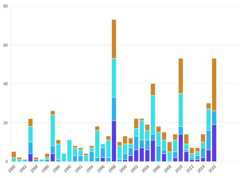
Flourish chart of 'Number of Coral Bleaching Events (1980-2016)'
Thus research and collecting the required information and data took me around a week. I ran into problems here due to my inability to code, which often ended up causing tasks to take longer. For example, scraping a website for the images of the Bleaching Alert Area map for around 20 years seemed like one such time-consuming task, but luckily I have a friend with knowledge in Python who was able to make it much easier for me. This only reinforced my desire to learn coding.
I used Flourish to make one of the charts, experimenting with different kinds to see which one would be visually relevant to the topic while also being easy to understand. My heart was set on waterfall charts but as they took longer to understand, I decided to make a bar graph instead.
I started with a list of questions I wanted to answer based on all the reading I had done, and what I felt was important to be included for the reader to be able to gain an understanding of the topic I was covering. This helped me organise my thoughts and also decide on the kind of content I wanted to include, as well as the order of content. In the end, I couldn't find an answer to all the questions, but I made sure to include as much information as I could, while also maintaining the length and amount of content.
After this, I began answering these questions, getting as much information as I could and making sure I understood everything, adding definitions and explanations for terms and concepts I was unfamiliar with, or that I thought would be useful to include in the final output. Much of the information I gathered here was not used in the end, but I deeply appreciated this step as I enjoy the act of learning itself, and it also helped me develop a sensitivity towards coral bleaching and how deeply interconnected the world is.
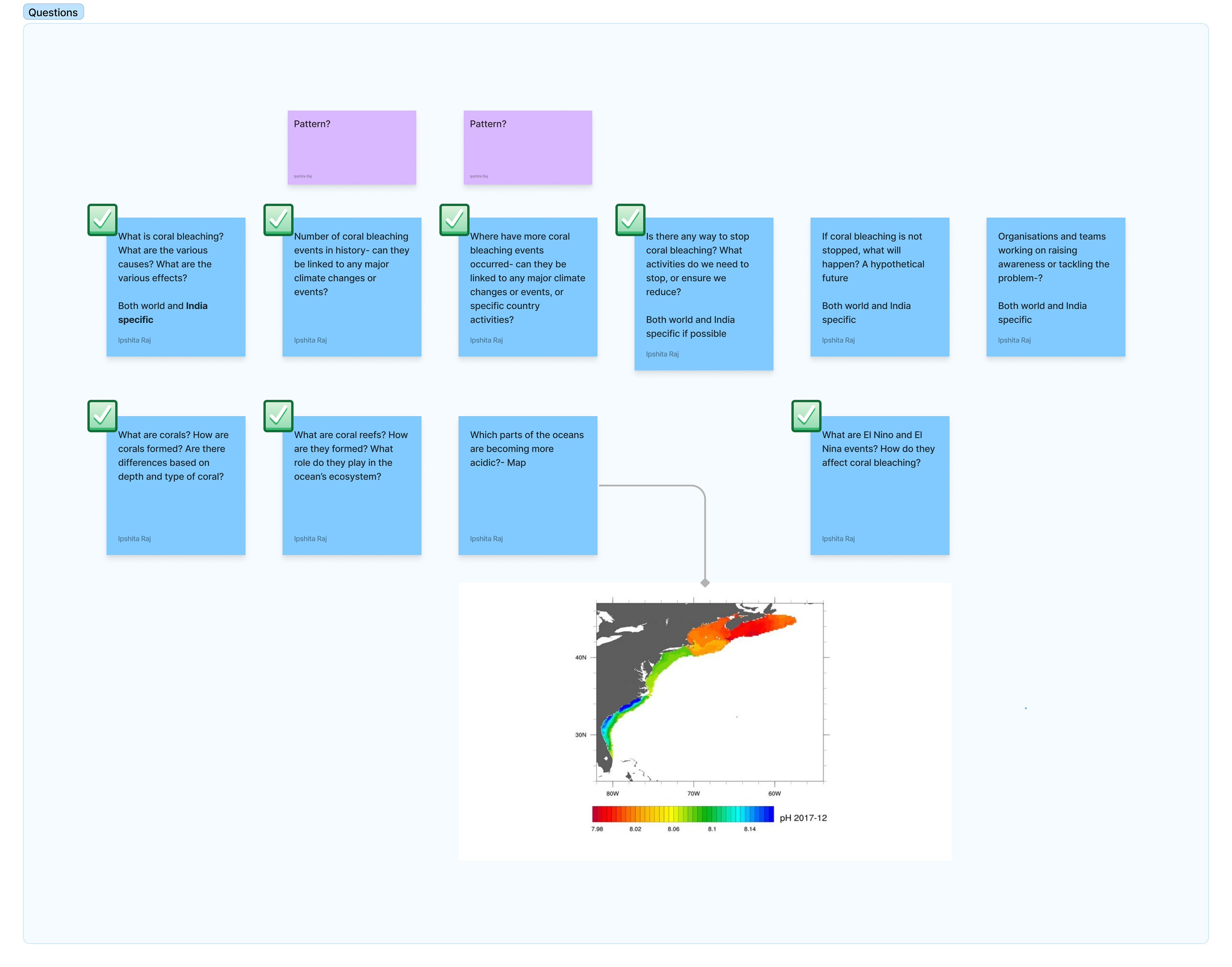
Questions
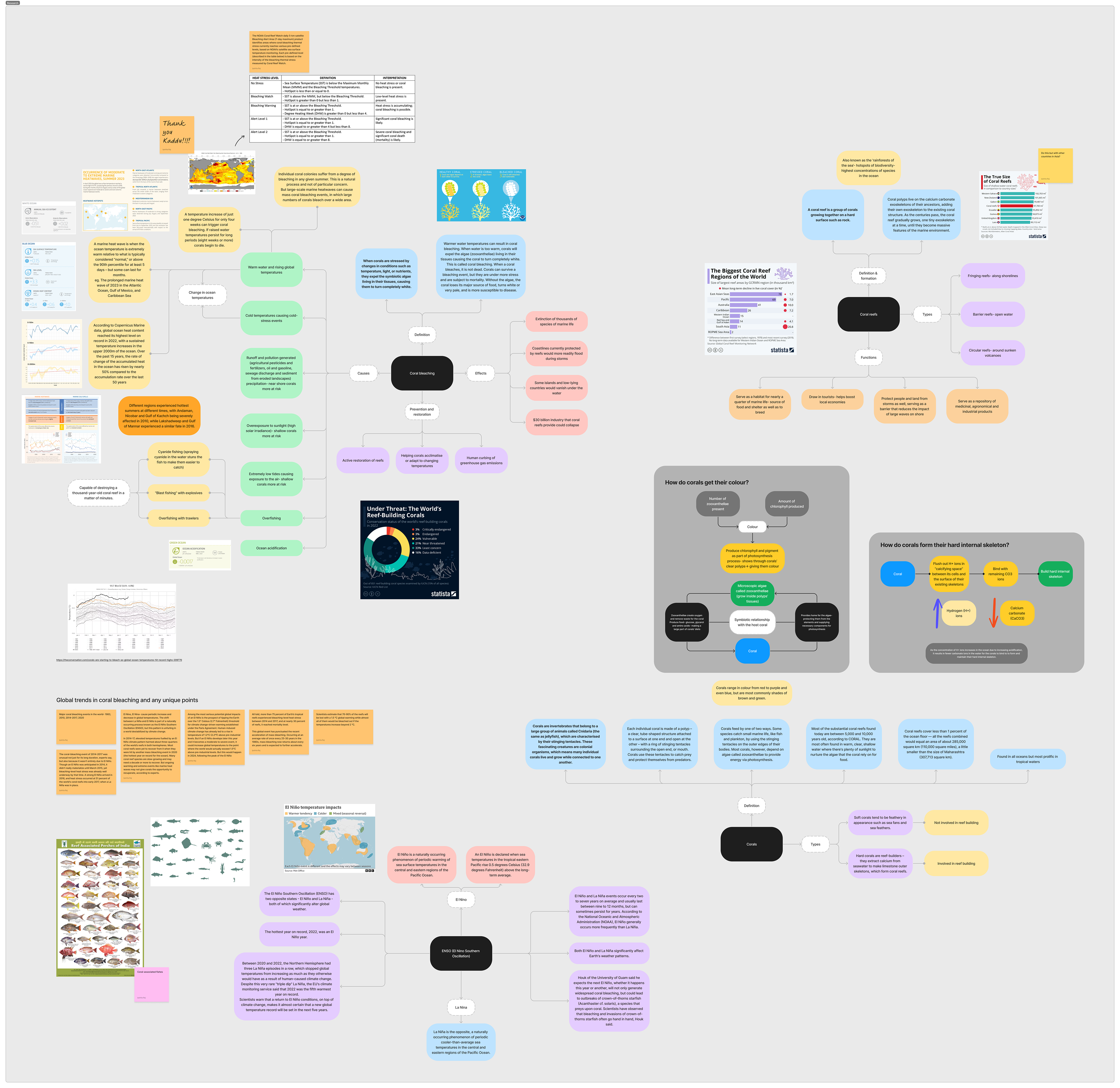
Research
I had kept a strict timeline for this project (as I had other classes during the day, and could only work on this in the evenings), in order to ensure that I would be able to finish it by a reasonable deadline. Thus after a week, I decided to stop doing only research and start making the final output.
I was initially confused between which design tool to use to make it: Figma, Readymag or Framer. Each had their own positive and negative points, along with my level of experience and comfort with each. In the end, I decided to go with Figma, due to the ease in being able to organise elements, among other things.
For the illustrations, I chose a style that was a mix of my own and science diagrams, in order to make it simple and easy to understand while also visually interesting.
A formal, yet friendly typeface that is suitable for all point sizes.
Greycliff CF
Click here to experience the prototype!
Note: Please open only with the following browsers: Google Chrome, Microsoft Edge, Opera GX (others may work as well but have not been tested). The prototype does not open on browsers such as Firefox, and I am currently trying to work around it. Thank you for your patience!
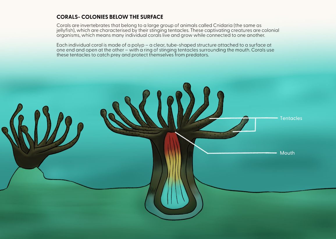
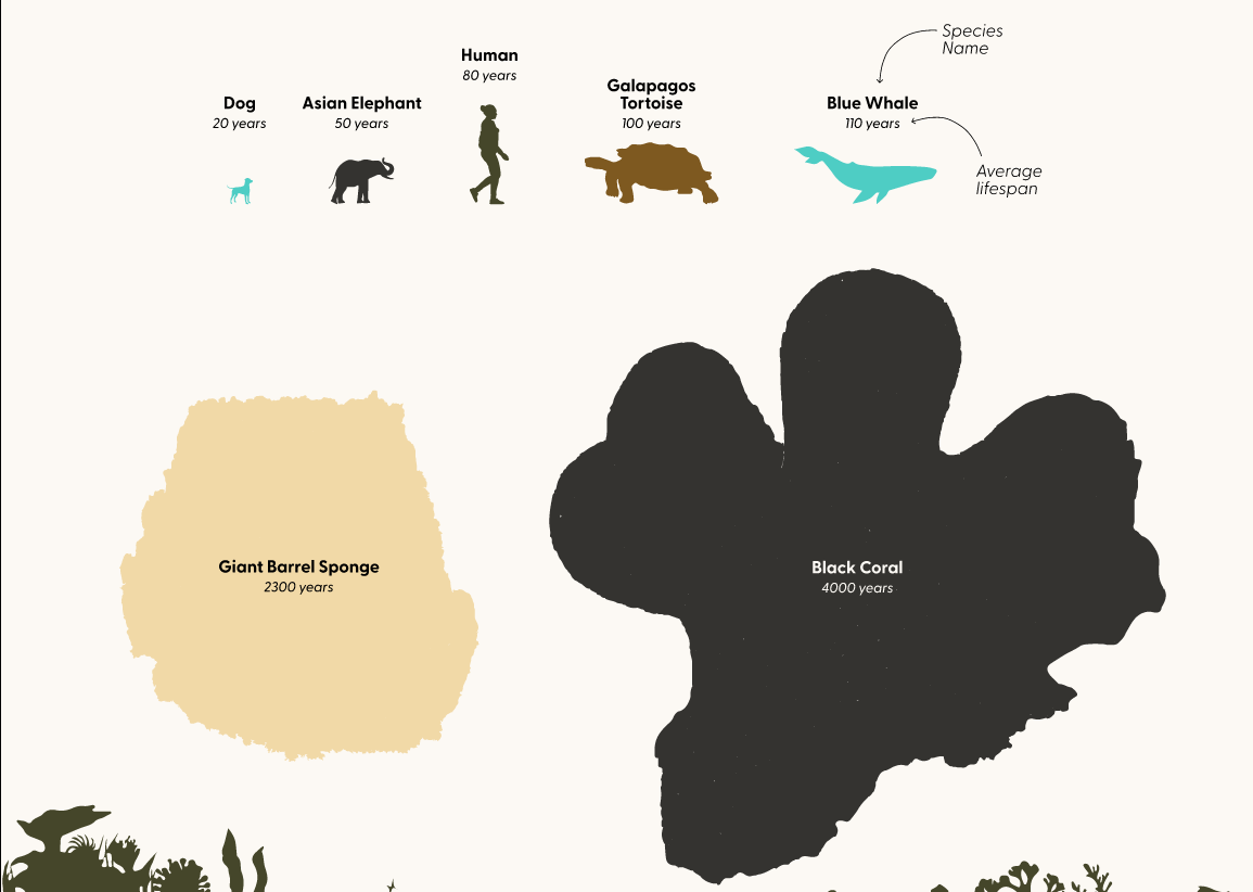
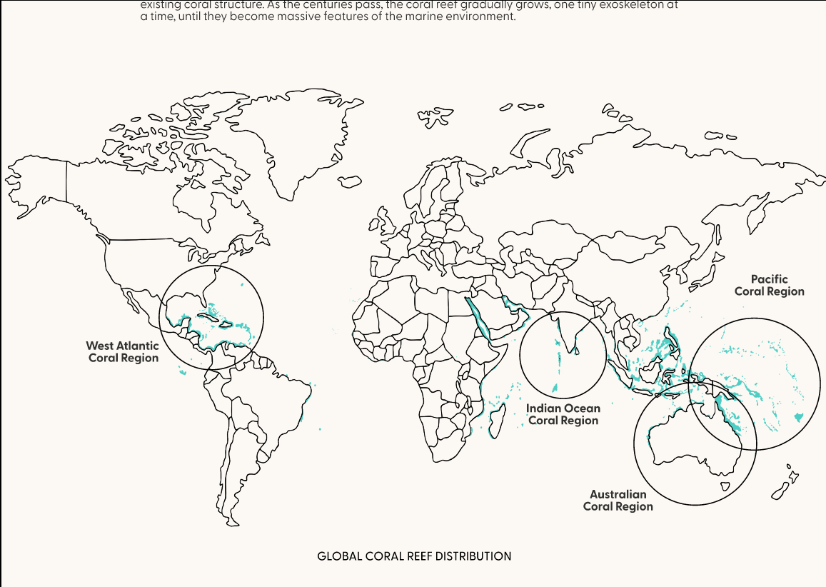
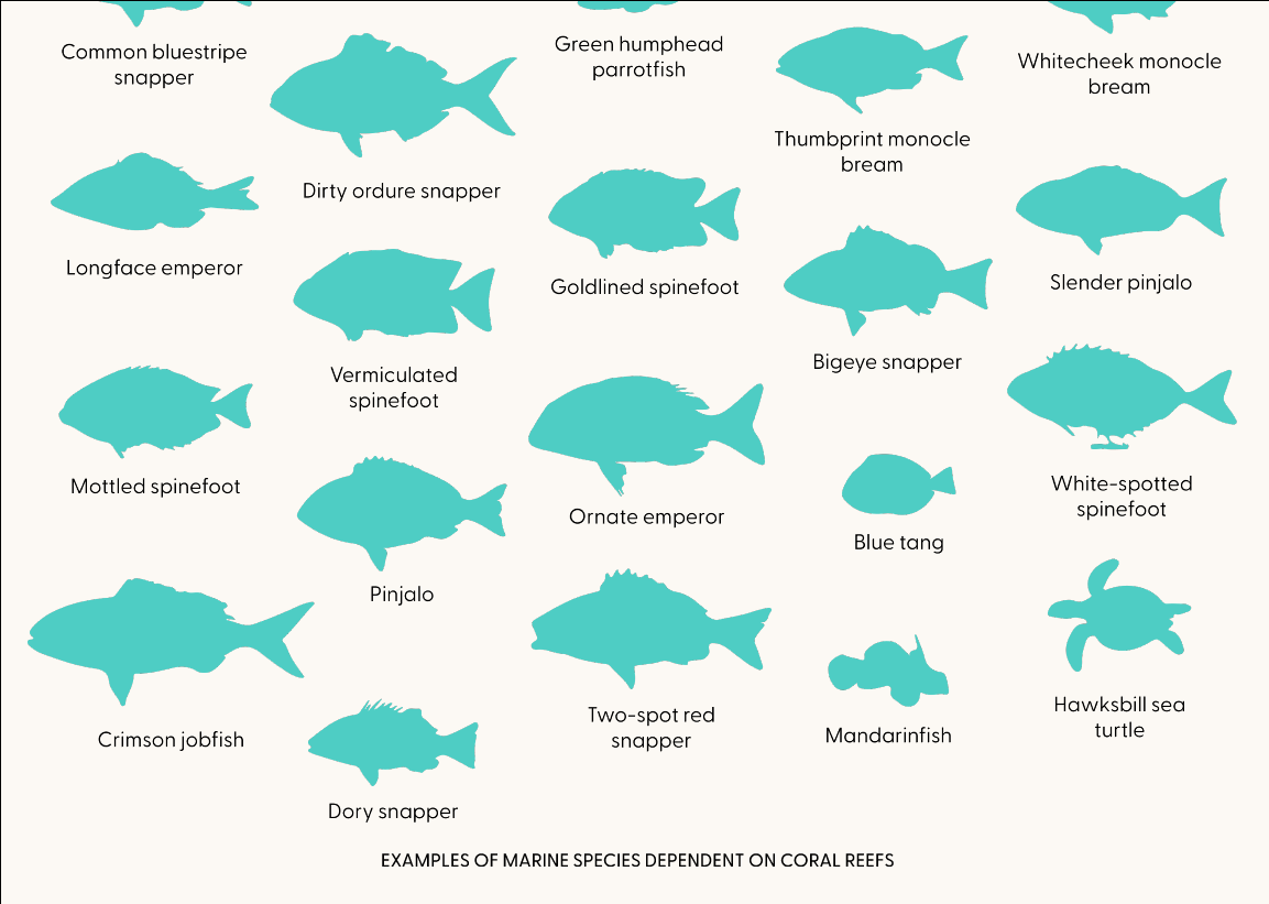
Some more screenshots from the final prototype
