Type: Class Project
Time Taken: 1 week | Software Used: Microsoft Excel
Making yet another poll on the effects of climate change seemed rather overdone, which is why we as a class decided to make one on the 'perceptions of climate change' instead. We all contributed to the list of questions, and decided to divide them into two polls to ensure that neither was too overwhelming to the people who would fill them.
In this way, we obtained two separate small databases with a few similar questions and majorly different ones, all from different demographics (depending on who we sent them to- for example, I sent the form I was in charge of to my mother who sent it to her friends in turn+ our facilitator sent it to her acquaintances which resulted in a more varied age range).
Next, we had to use this information and depict them visually in the form of data art. As our earlier projects were digital, we were requested to submit a physical project this time. This forced me to explore various other mediums of expression, keeping in mind availability of material, time, etc. But it also opened up my outcomes to be more 'interactive', which is something I prefer in my design work.
In the middle of the process, I also realised that the final forms that our projects end up taking have a big influence on how they’re perceived- for example, there are multiple charts that can be used to show the same dataset, but pie charts and bar graphs mean different things, and are used in different contexts. While either work, in most situations, one works better. It is something interesting to keep in mind as we explore data and how to effectively and aesthetically visualise it.
Thus I decided to make two outcomes:
CLIMBING HOPE
This data art project was born from the question: 'Do you believe that we can turn the situation around for us, as well as other living beings, in terms of climate change?'
Using the metaphor of a rope used for climbing, 'Climbing Hope' aims to represent the different kinds of answers we got for this question.
There are three different kinds of knots used in this project, with each representing a particular answer: a full knot represents 'Yes', a half knot 'Maybe' and no knot 'No'. This uses the concept of people using knots on a rope as hand- and footholds to climb upwards.
In the same way, people who truly believe that hope of a positive future is still present, will be more likely to actively participate in creating such a future, while people who answered maybe are on the fence, and may be pulled onto either side (hence the knots can be pulled open in one go), and those who answered no are unlikely to help or even try, so they have no knots, thus making the rope impossible to climb.
As scale was an issue, I had to use a normal rope, but my initial idea was to use a thick rope which could be tied to one of the upper floors, and people could actually climb my final output. This would make the meaning I aimed to show through this quite literal, as there would be areas difficult to climb and others which were much easier.
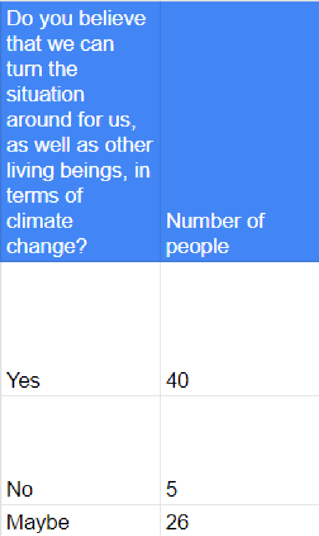
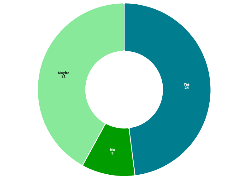
I collected the data in Excel and then used Flourish to visualise the data. This was not truly necessary to make the data art, but it was useful to see the difference between the number of answers visually.
What it did end up helping me with is making me realise the number of half-knots (the hardest to tie for me in the three) I'd have to make. But it was quite nice to see the number of people who were hopeful about the future.
It proved that had this been a scaled-to-life rope, it could have been climbed. The idea of it became a comfort to me as I worked on the actual knots in the rope.
LOOPS OF IMPACT
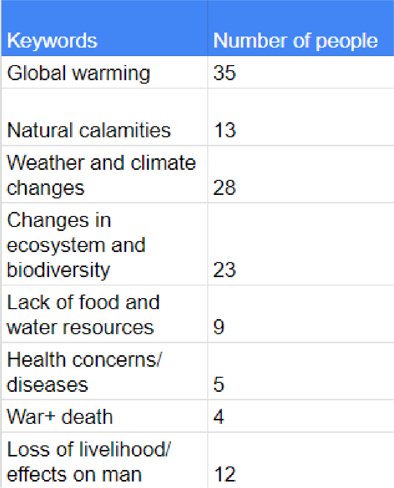
This data art project was born from the question: 'What do you think are the major impacts of climate change?'
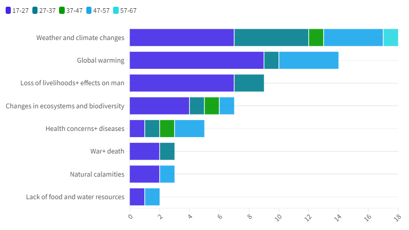
Using this question, Loops of Impact uses age as an additional criteria to explore the different categories people's answers to this question fall into, and whether they differ according to age. Each string represents one person, with the string being tied and looped around nails to wholly display their answer visually.\
After analysing all the answers, the different keywords and topics being
mentioned were made into categories which were used to make this information
visualization.
mentioned were made into categories which were used to make this information
visualization.
This project aims to show just how intertwined all the impacts of climate change
are to one another, and how we as living beings on this planet, form a web, how
we are all equally affected by anything that we do/ happens to our environment, and also where our concerns regarding climate change as a society
and as individuals lie.
are to one another, and how we as living beings on this planet, form a web, how
we are all equally affected by anything that we do/ happens to our environment, and also where our concerns regarding climate change as a society
and as individuals lie.
In terms of scale, I would have liked to make this bigger as well, with sturdier nails in order to be able to tie the thread properly in a way that it would be much more visible and easier to understand.
I collected the data in Excel and then used Flourish to visualise it to see the data for myself. Once I was sure that there was a visible trend (that is, certain keywords and topics were mentioned more often by people of different age ranges), I then began working on making the physical output.
I chose the form that I did as I believe that the world is connected in more ways than one, and thus also are the people who live on it. This along with the fact that many, if not most of the issues are interconnected, solidified my decision to use threads to make a spider web data art, with the different colour threads representing each age range.
However, I had planned this out with much thinner thread (or a bigger board). Thus the yarn ended up being a little too thick and too much for the thin nails to handle, which posed a problem to me due to which I had to cut down the number of responses I could display. I made sure that the original ratio of age ranges was maintained, in order to keep the visualisation similar to how it would have been had I used the entirety of the data.
But I still believe that my data art output shows what I wanted it to: the difference in keywords and topics of the concern people have related to the issues and effects climate change has on the planet and the creatures who live on it.
